Background
Objective
Make the contract reviews process amazing! Why? To avoid losing the client that is using this feature. How? Through shadowing, interviewing, and listening to legal associates using the feature, and iterating on solutions.
My role
Over 3 months, I lead the design of the contract review feature, and worked closely with customer success to gather feedback, followed up with user interviews to uncover deeper frustrations, and tested multiple solution hypotheses. Some ideas came from stakeholders and I refined them, while others required me to start from scratch or rethinking past iterations that didn’t work.
Outcomes & Impact
Faster & more transparent reviews, easier adoption, and measurable cost savings
150% faster contract reviews
By surfacing key terms and obligations upfront, legal teams drastically reduced manual search time; leading to an estimated €60K in annual savings per team.Greater reviewer confidence
Legal associates reported feeling more assured and in control, knowing critical data was structured and easily accessible.Less back-and-forth
Improved transparency and collaboration tools reduced handoffs and clarification cycles, saving time across departments.Easier adoption for new users
Centralizing all of your key terms and timelines, as well as making it easier to perform key actions, made the feature far more intuitive and simpler to adopt.Lower risk of missed obligations
Automated surfacing of deadlines and clauses reduced human error, strengthening compliance and peace of mind.Real praise from legal professionals
One associate summed it up: “For once, it felt like the tool was working with me.. not just giving me more to manage.”
Core problem
Legal associates were spending excessive time manually reviewing, verifying, and editing critical contract terms buried in lengthy PDFs. The existing solution offered AI extraction of terms but introduced new friction points:
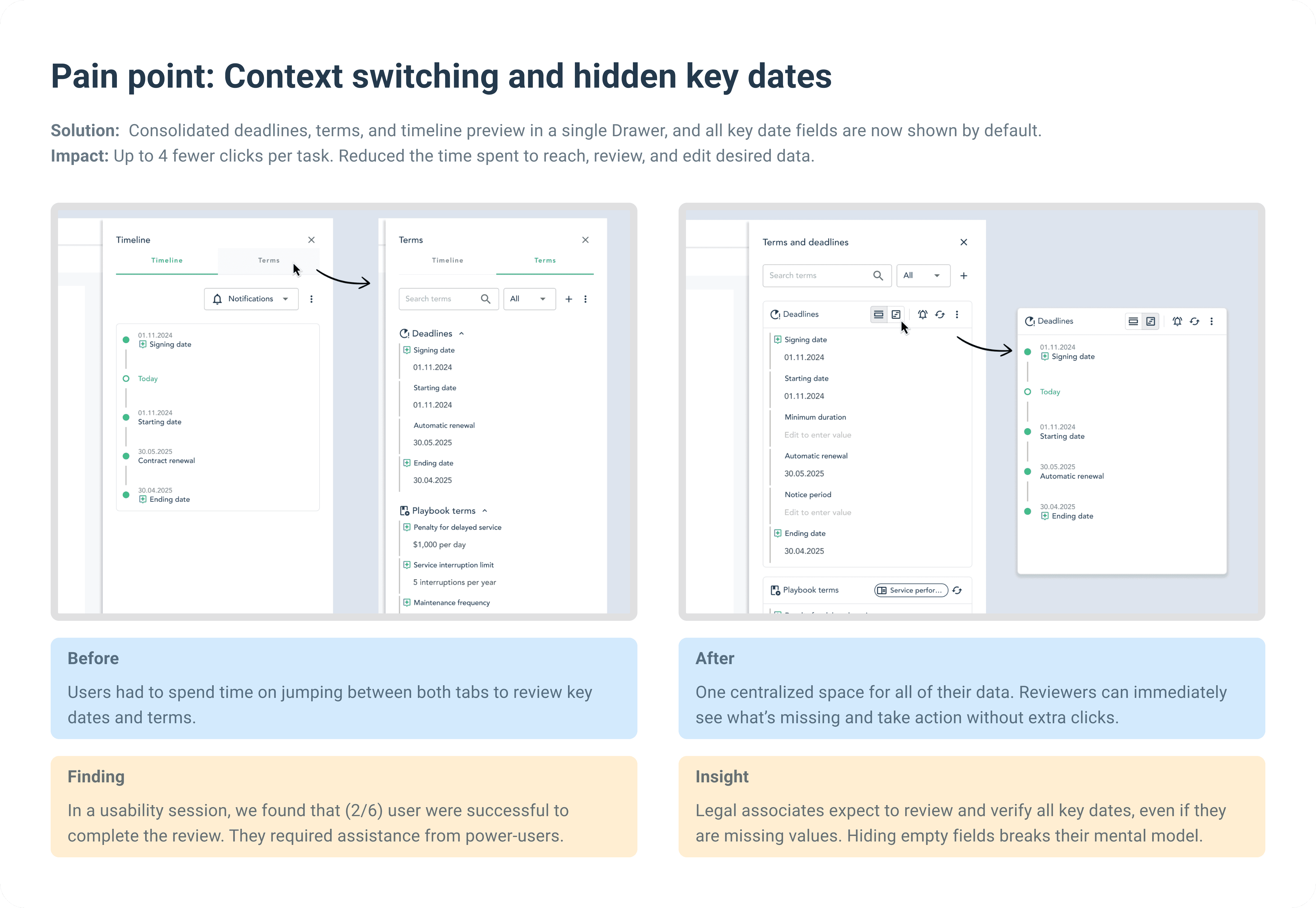
Tedious context switching: users jumped between multiple tabs, sections, and PDFs.
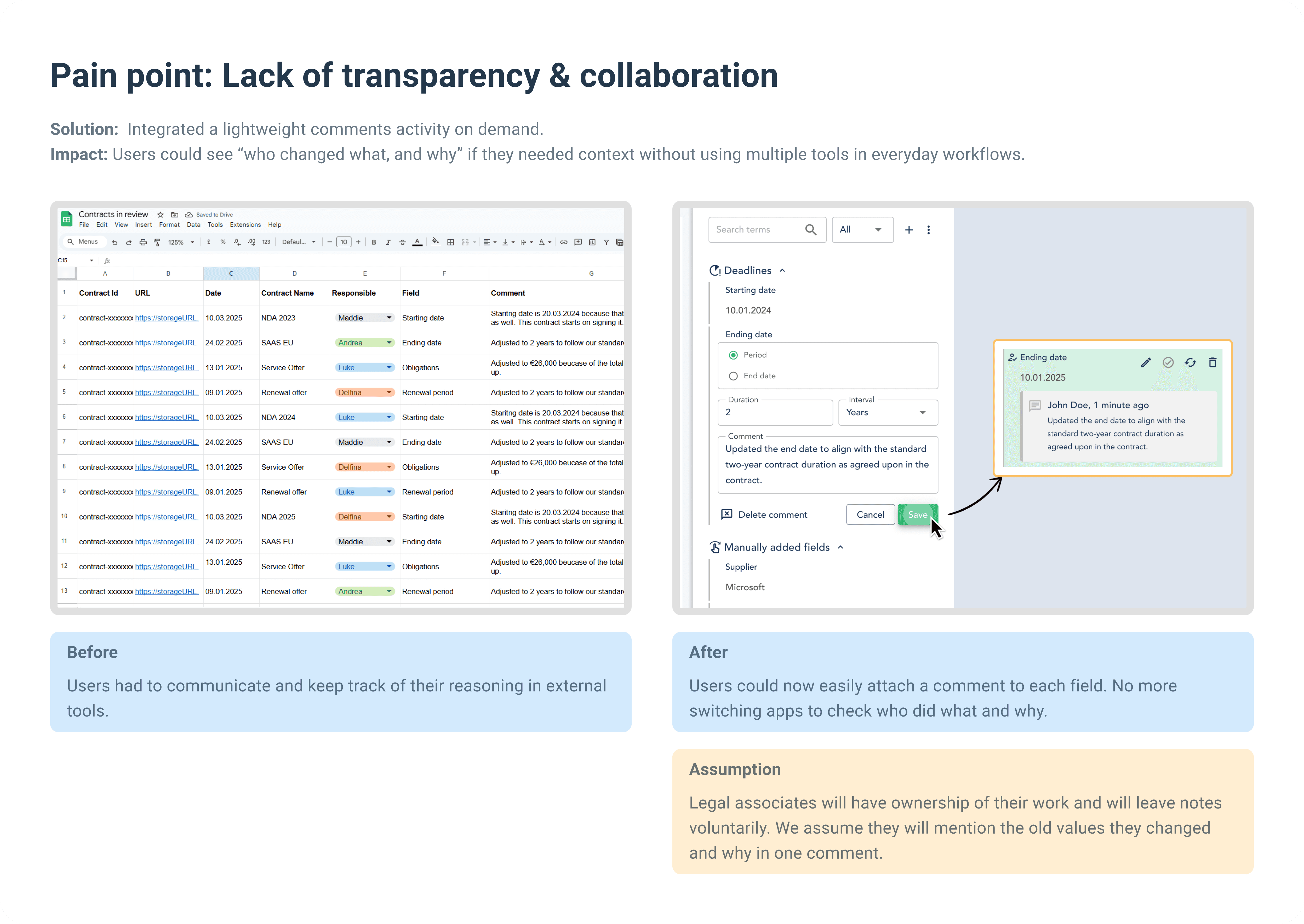
Lack of transparency: teams couldn’t easily track or explain changes made to AI-extracted terms.
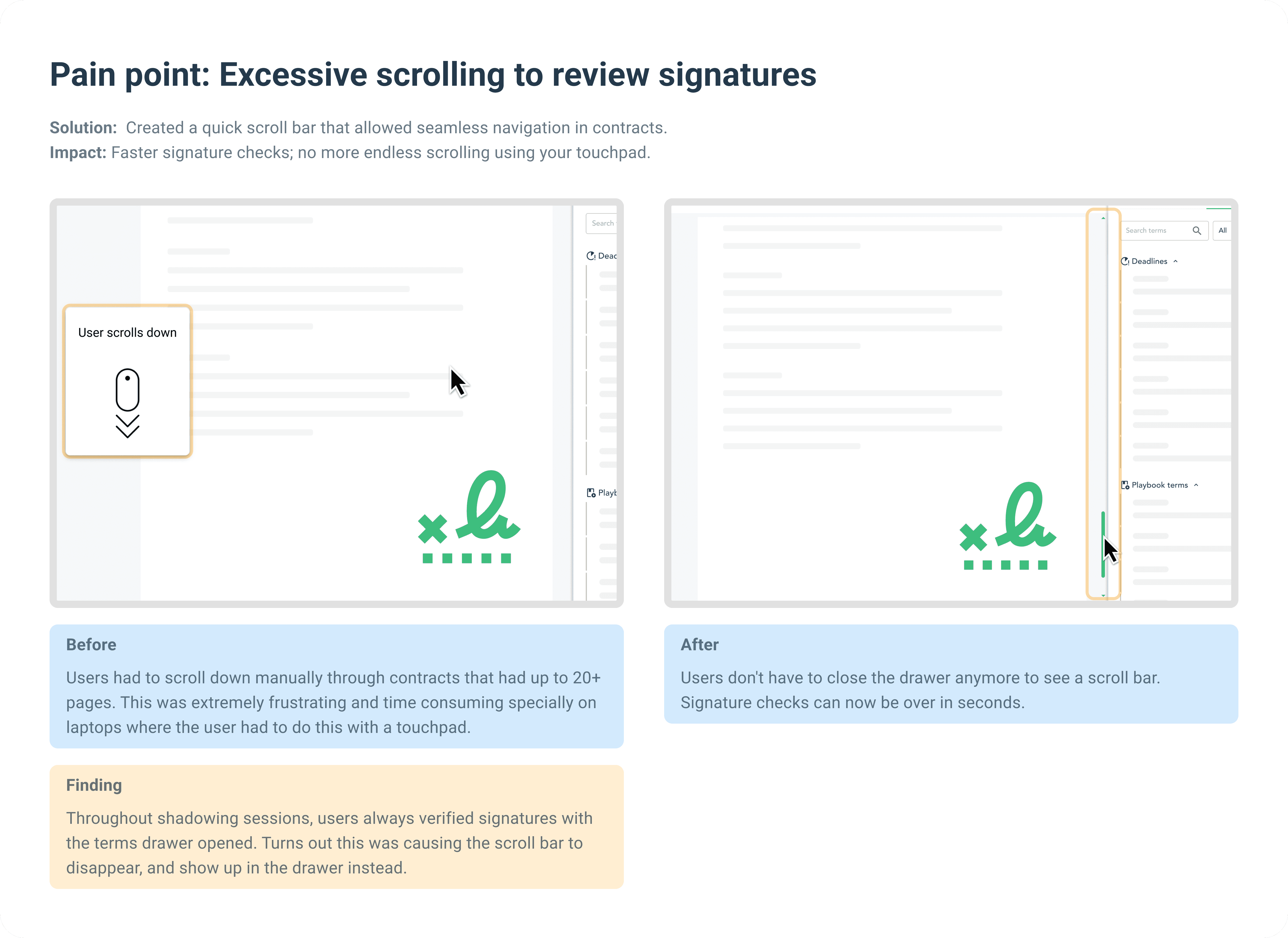
Hidden key dates & signatures: vital information like signing dates was not always easy to surface.
Excessive clicks & hidden actions: common tasks required multiple unnecessary clicks.
The impact was clear: contract reviews dragged on, critical deadlines got overlooked, and legal teams felt frustrated by “go-to” product features that still slowed them down.
Discover — Research Phase
Approach
Before jumping on generating solutions, I diverged and explore what problems are there in the product based on direct feedback from power users. This step gave me and the team the clarity needed to understand that we are solving the right problems. Here's an overview of what I did to gain that clarity:
User interviews: conducted with power users (legal associates) to uncover pain points and explore what desires and needs they had.
Shadowing sessions: observed users in real time, capturing how they navigated the product and where they got stuck. This revealed hidden friction points that users might not mention in a simple Q&A, and it insights the creation of a detailed user flow that reflects how users truly experience the feature.
Analyzed Customer feedback portal reports: issues sent to our Customer Success team provided recurring patterns which I grouped and analyzed.
User Flow Mapping
Goal |
|---|
Understand how customers currently review contracts and pinpoint where they encounter friction in the existing solution. |
Activity |
I scheduled 4 shadowing sessions with the same customers, pairing interviews and direct observation. As they went through their daily contract reviews, they spoke out loud about the steps they took and the difficulties they faced. By creating a detailed user flow, I could see exactly where frustrations popped up—whether it was an extra click, a confusing label, or a missing feature. |
Outcome |
The final user flow diagram revealed multiple friction points along the journey. These ranged from initial navigation issues to hidden or overly complex actions for editing deadlines and other terms. I then grouped these micro-level pain points into common themes, giving me a clear roadmap of which areas needed the most urgent UX improvements. |

Define — Synthesis Phase
Key Findings
Context switching: constantly moving between the “Timeline” view and “Terms” tab was frustrating.
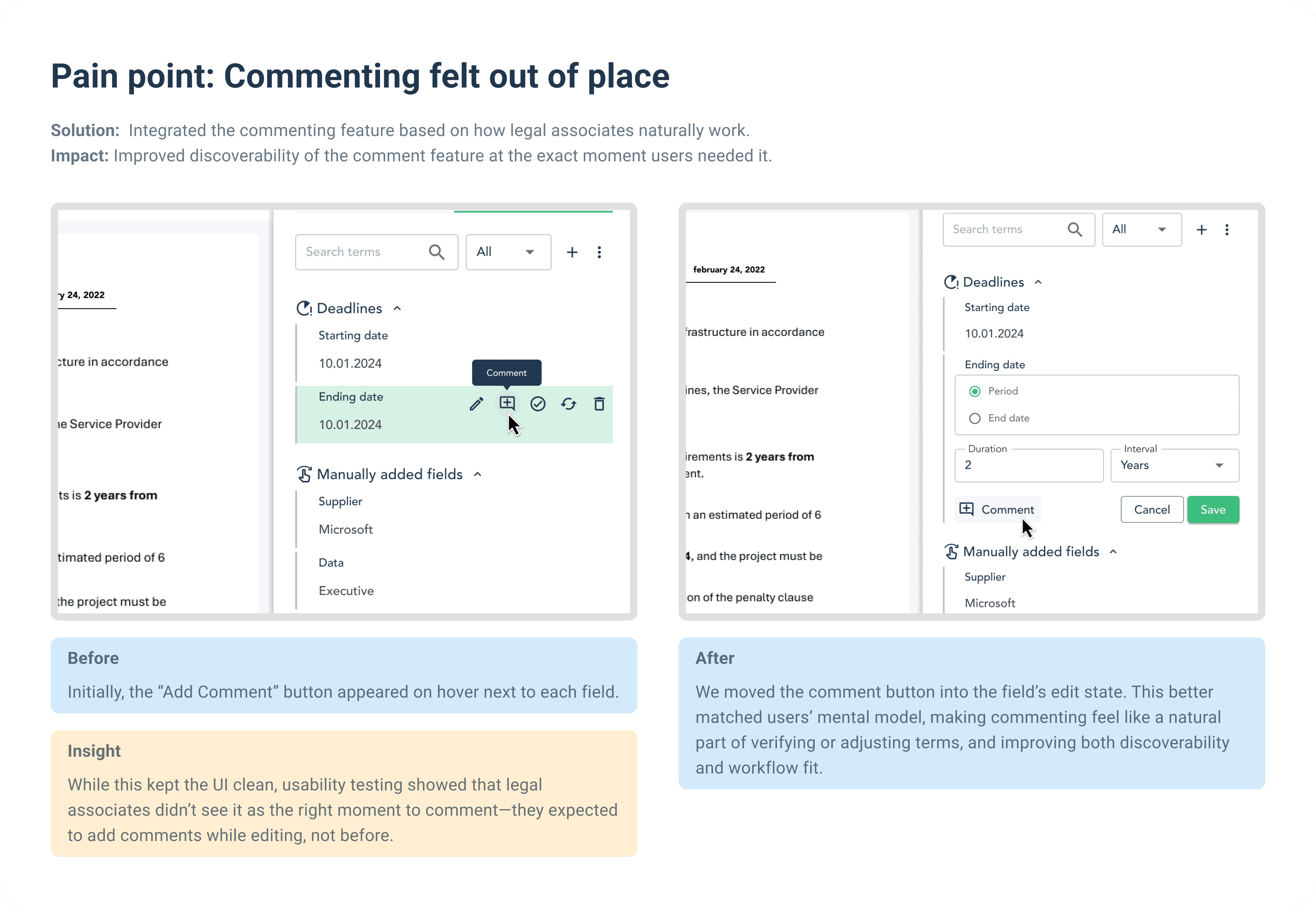
Lack of collaboration: users had no clear audit trail to see who made edits or why.
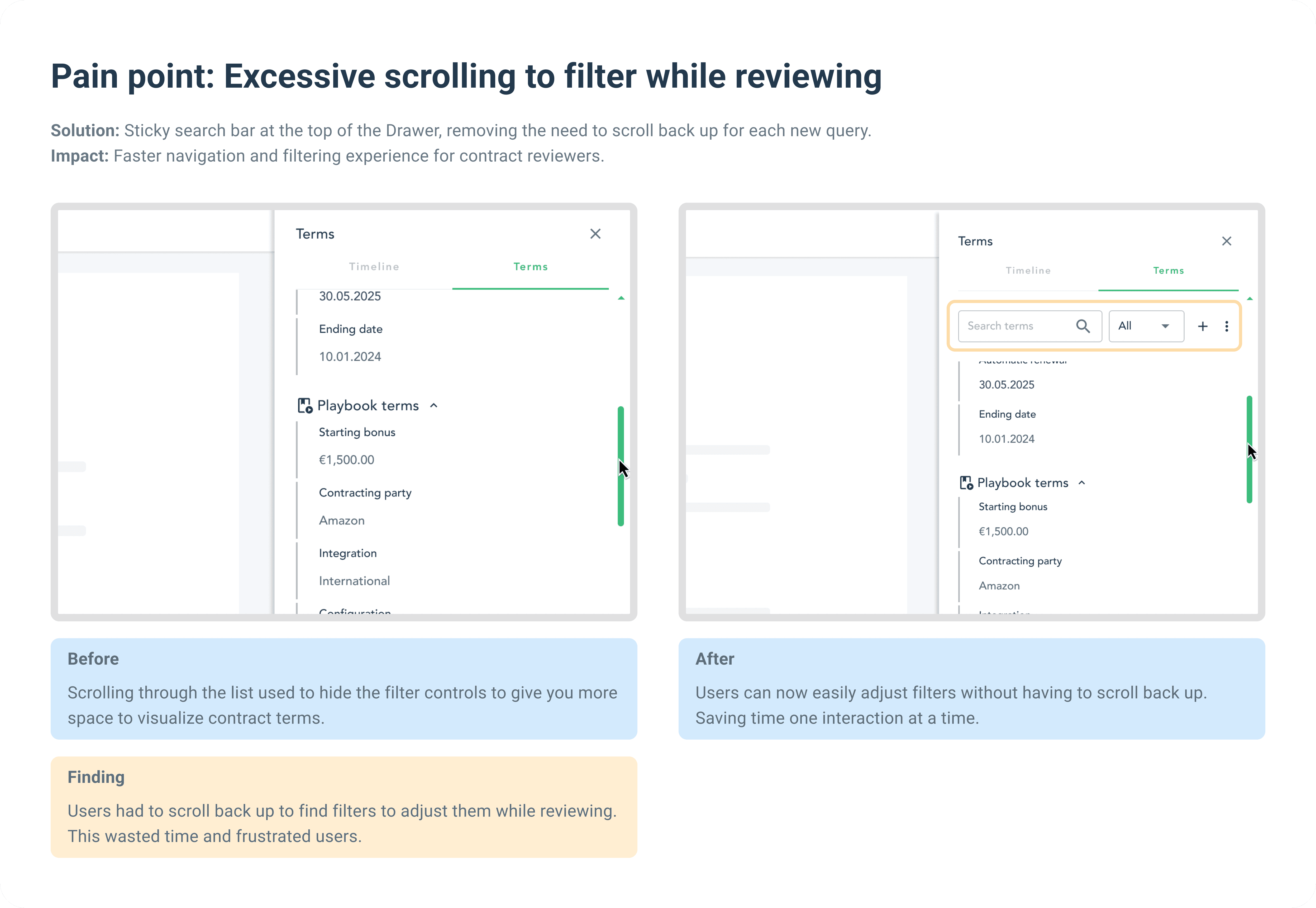
Hidden signatures and important dates: Scrolling to the bottom for signatures or scanning multiple pages to verify deadlines wasted a lot of time.
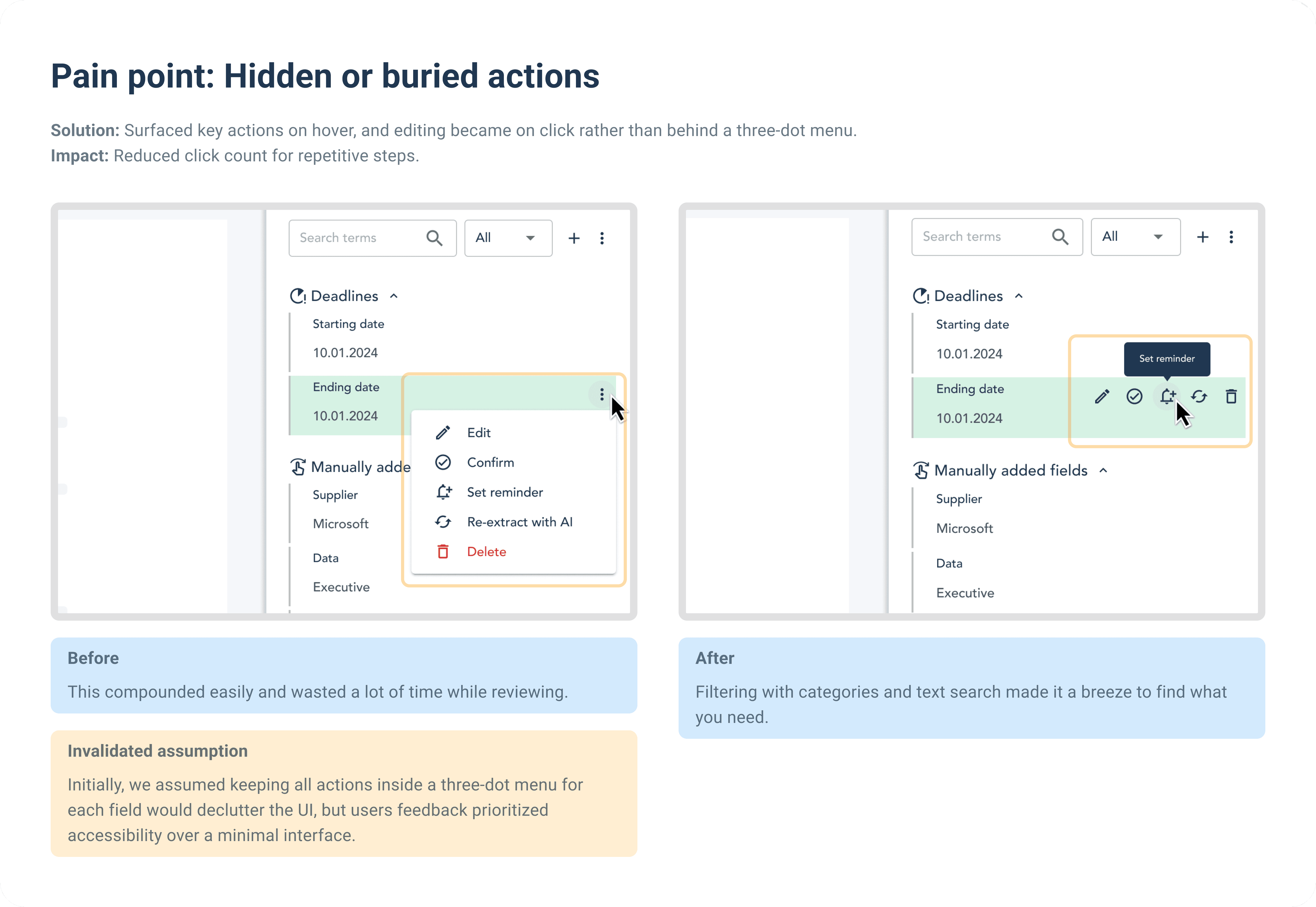
Rough path to value: standard actions (such as editing) were buried behind three-dot menus and many clicks.
Need for centralization: users wanted a single, flexible place to edit, and review all extracted terms and timeline.
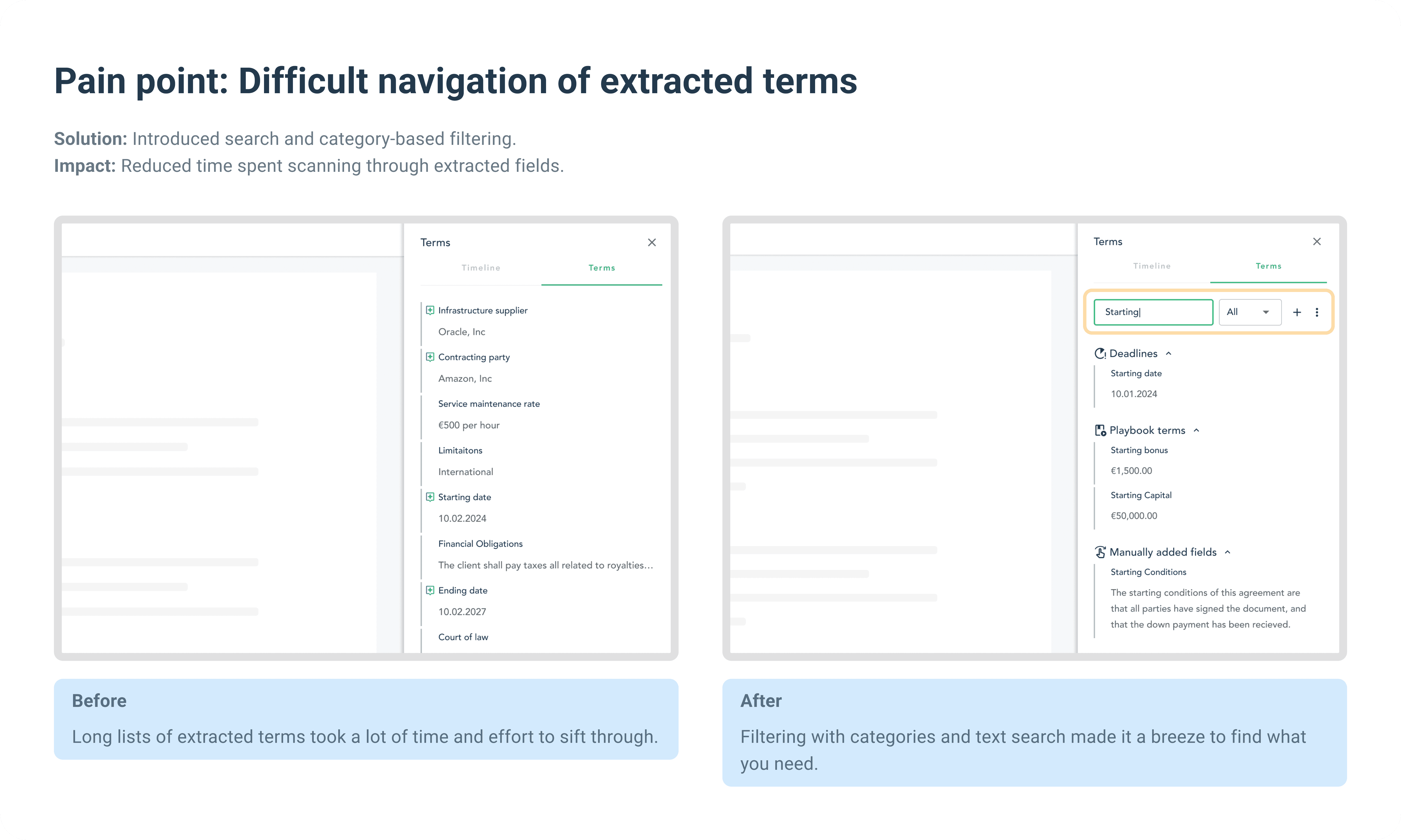
Difficult navigation of extracted terms: There's a lot of data, and it requires users a lot of effort to parse the list for what they need to review.
Insights
Clear mental models: reviewers know exactly what they need, and expect navigation to match their search approach.
Strategic scanning: they don’t read everything. They just scan to confirm AI-extracted terms.
Tiny tasks add up: actions such as reopening a menu to edit a field, repeatedly parsing the list searching for a field, and repeatedly scrolling down a big document to see the signatures compounds into major inefficiencies in the workflow.
Legal associates have a lot to do: Legal associates often handled large numbers of contracts with a lot of data to review, and a tight deadlines; making repetitive tasks inefficient.
Desire for one place for everything: the need for a centralized space for all deadline-related actions rather than forcing users to jump between different sections.

Develop — Ideation Phase
To quickly validate ideas and align with stakeholders, I started with low-fidelity wireframes. These rough sketches helped us make fast, and informed decisions on how to tackle the most pressing UX issues and learn what are the viable paths before investing time in higher-fidelity prototypes.

Deliver — Iteration-Driven Implementation
With a clear understanding of the problem and solution spaces, this chapter focuses on how continuous user feedback shaped and validated the final design.
Validation through user testing
Usability testing: Conducted with 8 legal associates who frequently handle large volumes of contracts.
A/B comparison: Compared between live prod environment, and designed interactive prototypes.
Metrics Tracked:
Time to locate critical terms and signatures
Click count to edit key terms or deadlines
Task completion rate for communicating changes via comments
Usability & satisfaction, measured through direct user feedback
Results and Impact
Through multiple iterations, usability testing, and direct collaboration with power users, the feature evolved into a go-to tool for contract review, enabling legal teams to work faster, smarter, and with fewer frustrations.
Measurable Outcomes
150% Reduction in review Time |
|---|
By minimizing context switching and simplifying interactions, legal associates could complete their contract reviews in less than half the time. Improvements included up to 4 fewer clicks per major action. |
€60K Annual Savings Per Legal Team |
Increased efficiency translated into substantial cost savings, reinforcing the ROI and the business value of the feature for legal teams and its impact on their workflow. |
Positive User Feedback
“This is exactly what I have been wishing for! Now I don’t waste any time.”
– Legal Associate
“I no longer have to keep track of these notes in a google sheet I can do it all in the app. This is great!”
– Legal Associate
“It’s so much faster to report key dates to stakeholders and get real work done.”
– Senior Legal Reviewer
“I don't know if you can see my video feed by I'm literally smiling... this is exactly what I have been waiting for!”
– Legal Associate
Reflection
This journey proved that UX is never "finished." Each iteration was fueled by user pain points, and every improvement was a direct response to how legal teams actually work. By listening, testing, and refining, we didn’t just improve usability—we delivered real business value.